Want to capture the growing mobile audience? Learn how to master mobile-first design using responsive design practices to optimize the customer experience.


Want to build a mobile-friendly website? Then, it’s time to embrace a mobile-first design philosophy and start using responsive web design. Creating a fluid layout can produce clean and professional sites for mobile and desktop users, ensuring your content and website look the same regardless of screen size or device.
Let’s look at how to master the mobile-first design process using responsive design practices and intuitive navigation.
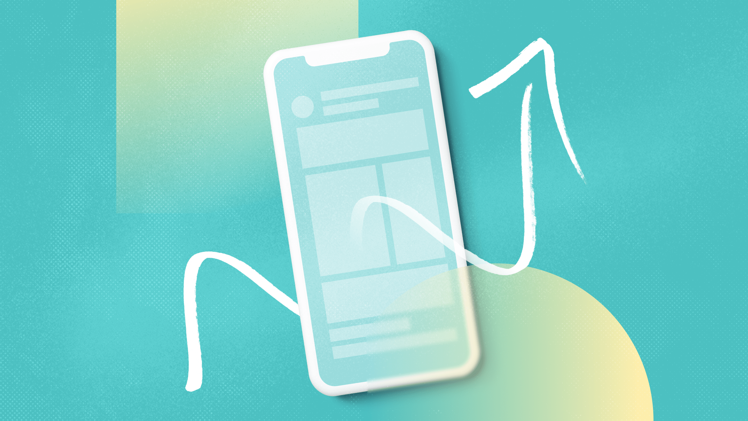
What Is Mobile-First Design and Why Does It Matter?
Mobile-first design is an approach where websites and applications are designed and developed specifically for mobile devices, prioritizing their smaller screen sizes and touch-based interactions.
Instead of starting with a design for desktop computers and scaling down, mobile-first design begins with mobile devices as the primary focus. This ensures the user experience is optimized for mobile users, creating a seamless and user-friendly interface.
Ready to dive in? Here are five tips for mastering mobile-first design.
1. Design With a Mobile-First Approach
When smart mobile phones took off in 2010, Eric Schmidt, the CEO of Google, announced that the search platform would adopt a mobile-first design:
“What’s important right now is to get the mobile architecture right. Mobile will ultimately be the way you provision most of your services. The way I like to put it is the answer should always be mobile first. You should always put your best team and your best app on your mobile app.”
Google’s forward-thinking approach paid off as smartphone penetration rates in the US skyrocketed from 2010 to 2021.

Moreover, by 2025, it’s predicted that 87% of all mobile users in the US will own a smartphone — a steep increase from 27% back in 2010.

If that doesn’t convince you to start with a mobile-first design, here’s some more good news:
Once you’ve embraced mobile-first design, designing for desktop becomes easier.
You’ve already established a solid foundation by prioritizing the mobile experience, meaning you can then adapt and optimize the design for larger screens and take advantage of the additional space and capabilities that desktop devices offer.
TL;DR: By starting with a mobile-first approach, you can ensure your design is responsive and consistent across all devices, providing a seamless user experience.
2. Create a Website Must-Haves Checklist
Before working with a designer to create your mobile website, create a list of key elements you’d like them to include as part of their design method.
For instance:
- Specific clickable elements, such as calls to action (CTA) buttons or digital forms
- Fluid images
- Visual elements, such as logos, colors, fonts, symbols, and illustrations
- UX elements, such as intuitive navigation menus, a chatbot plugin, and the ability to submit bug reports
- Placement of forms, tabs, and sections
Be sure to also be clear about who you’re targeting on your site so your designer can keep your business goals and audience top-of-mind during the design process.
*Pro-Tip: Create a policy to help your organization review and approve design decisions as efficiently as possible. Be sure to note who needs to sign off on the design before giving it the official go.
3. Save Time With Responsive Web Design
Apply responsive web design practices to fast-track the mobile design process without sacrificing quality.

With responsive design, your website will automatically adapt its layout and appearance based on the screen size and device it’s viewed on.
This revolutionary concept was coined by Ethan Marcotte, otherwise known as The Godfather of Responsive Web Design.
Ethan stressed that a device-agnostic layout with flexible images, media queries, and fluid grids is critical to creating responsive websites.
A fluid and flexible approach means users will have a consistent and optimized experience, whether they’re accessing the website on a desktop computer or a mobile device. With responsive grids and flexible layouts, websites can easily adjust their content to fit different screen sizes, resulting in a seamless look and feel.
But flexibility and fluidity aren’t the only factors to consider. Accessibility and inclusivity are also essential components of adaptive design and, more importantly, of remaining GDPR-compliant.
Designers and developers should strive to create websites that are accessible to all users, including those with disabilities. To ensure your site passes the test, check out accessiBe’s free accessibility checker, accessScan:

To use the checker, simply enter your domain, receive your detailed audit, and download your report to share with your website developer and design team. Then, create a plan to correct all the issues the report flagged.
4. Keep Your Design Simple and Focus On Intuitive Navigation
While it might feel tempting to flood your website with sliders, videos, and custom images, if it creates a clunky look or messy navigation – it’s not worth it.
Instead, stick to a clean and minimal design that matches the look and feel of your brand and has ultra-intuitive navigation.
In other words, you want users to be able to scroll up, down, and throughout your site without even thinking about it. This includes navigating other essential pages on your site, like your online store, blog, and knowledge base.
To streamline navigation, add quick links and tables of contents at the top of dense informative pages or blog posts.
These navigational tools act as a roadmap, guiding readers through the page’s sections at a glance. Users can also click on each link, and your site will auto-scroll them down to the area they want to view.
For instance, look at the following blog post on TeamViewer alternatives by TSPlus:

As you begin reading, you’ll notice a thoughtfully placed table of contents just below the introduction. This strategic positioning allows users to effortlessly assess the full scope of the content and encourages them to keep scrolling or jump to a section to learn more.
By optimizing the table of contents for mobile viewing, TSPlus ensures that readers can easily access specific sections of its blog posts even on smaller screens.
Another excellent example of a site with intuitive navigation is StudioSuits:

StudioSuits uses intuitive navigation to nudge prospects and customers to check out its deals. It offers a robust but highly organized product menu and provides users with actionable choices the moment they land on its webpage.
Users can choose between two prominent buttons: “Suits under $299” or “Jackets under $199”, allowing them to explore tailored selections that align with their preferences and budget. This win-win approach puts purchasing power back in their hands while nudging them closer to conversion.
5. Guide Ideal Customers to Conversion With Intuitive Call-To-Action Buttons
Use clear and engaging CTAs that motivate users to take inspired action. Mobile users are more likely to convert if they see a compelling and relevant offer that matches their intent and needs.
Take this tip up a notch by providing helpful guides and answers to their FAQs. By pairing tailored CTAs with informative content, you can build trust with your target audience, help them solve their problems, and move them along your sales funnel.
Here’s a great example by Pumpkin, a pet insurance company:

Pumpkin created a helpful article on this page about the average cost of pet insurance – one of the most common topics its target audience has questions about.
It also added a visible and intuitively placed “Create My Plan” CTA button at the top right of the screen to encourage viewers to become customers.
If you check out the above page on your smartphone and desktop, you’ll also notice it has a mobile-first design, a simple and responsive layout, and a user-friendly interface that loads quickly.
Pumpkin ticked all of the boxes with this page. And if you peruse the rest of its site, you’ll notice it’s right on the money. It’s full of helpful guides, feels incredibly natural to scroll through, and has a clean and minimal design.
Master Mobile First Design Today!
Once you’ve designed your new site, remember to perform usability testing to ensure a seamless user experience on all screens, sizes, and devices. Check that your load times are quick and for any potential bugs or security issues.
Once your website passes the test, consider presenting it to a focus group to get their input on ease of use, intuitiveness, and other relevant feedback. Continue testing and refining your site as technology improves so you can always put your best foot forward. Happy designing!
Looking for an unlimited creative subscription? Check out Envato Elements for millions of creative assets at one low cost.


