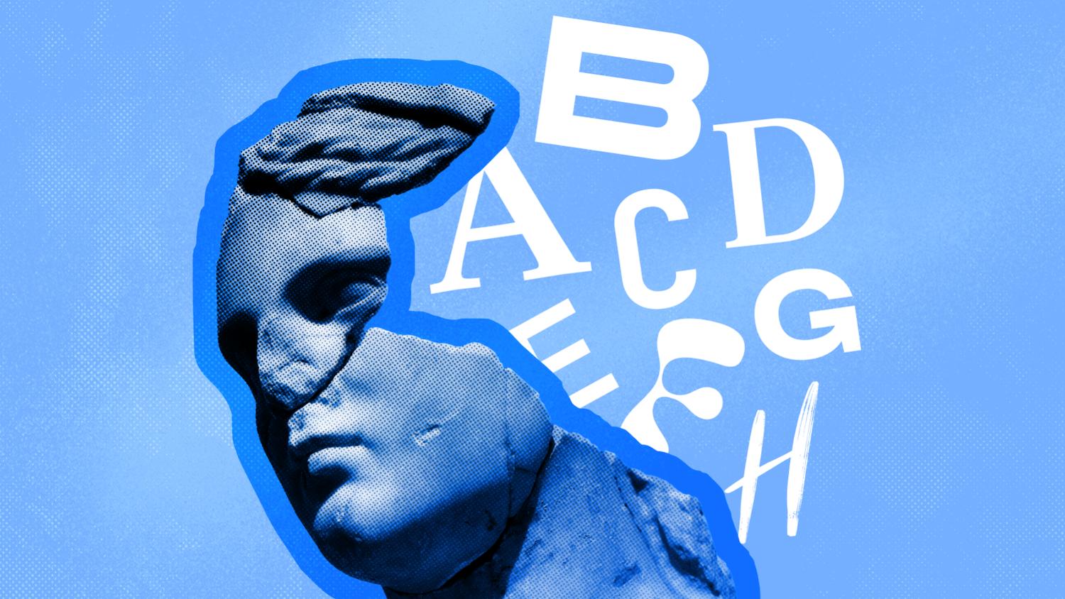
Ever wonder why some designs just click? Unlock the secrets of design psychology and discover six principles to create experiences that inspire and engage.


You’ve probably heard of color psychology—how different hues can evoke certain emotions—but design psychology takes this concept to a whole new level.
Design psychology unlocks the secret to how we naturally interact with visuals, shaping intuitive and impactful experiences. By tapping into the design principles that influence human behavior, you can craft user experiences that don’t just look good but inspire action and emotion.
And the best part? You don’t need a psychology degree to master it!
In this article, we’ll explore six design principles UX designers can use to captivate, engage, and delight their audience. Let’s get started!
What is design psychology?
Design psychology aims to understand the psychological patterns that drive decision-making and emotional responses. Specifically, it considers how we resonate with certain types of navigational flows, visuals, aesthetics, and cognitive loads.
Through this understanding, UX designers can inform and enhance designs to create websites, apps, and SaaS products that visually and functionally connect with customers.
How design psychology can benefit UX designers
When UX designers understand the psychological principles that govern human behavior and emotions, they can apply these insights to drive two key benefits: superior product development and customer satisfaction.
Superior product development
Design principles can be leveraged to proactively develop a product that’s geared towards customers — what captivates them, holds their attention, and provides them value. This enables you to enter the market with a product that’s immediately capable of resonating with your target audience. Plus, it helps you avoid implementing common design faux pas.
Improved user satisfaction
The more you understand human psychological preferences, the more effectively you can cater to people’s needs in a way that feels authentic.
For example, simplicity, intuitiveness, and accessibility are all design features that connect with customers on a psychological level. Why? Because they make engagement effortless, accelerating the value they get from interactions. In turn, customers experience greater satisfaction.
6 design psychology principles to elevate your UX designs
Want to your designs to make an impact? Here are six principles of design psychology that you can start implementing today.
1. Effortless engagement

Your website or app’s design needs to do more than visually appeal to your audience. It needs to captivate and engage them enough to maintain their attention effortlessly, with minimal distractions and obstacles.
Here are some strategies to consider:
Simplicity
Complex, convoluted designs are overwhelming and frustrating. Worst case scenario, they trigger the well-known attention span killer — cognitive overload — which occurs when your brain is trying to process too much information at once. So, it’s essential that your interface is clean, organized, and free of unnecessary elements.
Functionality
An engaging design empowers users to effortlessly achieve their goals, whether that be searching for information on your website or using your product to complete a task. So, your design needs to serve its purpose by including and clearly signposting the features, tools, and info that users will need to use your application to its full potential.
Asana’s work management platform, for example, has a simple drag-and-drop design and clean, intuitive interface to enhance functionality.
Motivation
Motivation is the driving force of engagement. Enriching your app with enjoyable, interactive elements that effortlessly escort users toward their goals can prevent boredom and churn.
For example, personalization attracts users toward the content and features they’re interested in, accelerating value. There are a variety of SaaS examples that you could use to help you collect relevant customer data, such as CRM systems and data analytics platforms.
Other motivational design elements include:
- Progress bars
- Animations
- Micro-interactions
2. Visual salience

Visual salience describes a perceptual quality in visuals that makes them stand out and grab our attention. You can use visual elements, such as color, size, contrast, and positioning to create a clear visual hierarchy.
In other words, you can strategically guide the user’s attention toward the information you want them to engage with.
Color and contrast: Color and contrast are often used in conjunction to highlight key information, such as call-to-actions. In the example below, you can see how the website uses green buttons and capital letters to create a contrast between the white space and black, lowercase text, drawing the eye toward the CTA. Other examples include using type contrast, such as bold, italics, and font variances.
Size: Larger elements stand out from smaller elements, creating a visual hierarchy. Headings tend to be in larger font sizes, followed by sub-headings and then the bulk of the content. This enforces visual salience, guiding attention and streamlining experiences.
Positioning: By placing the most important elements in prominent positions — such as at the top, center, or “green zones” of the screen — you guide the eye toward these elements first.
3. Cognitive harmony

Cognitive harmony, or cognitive consistency, describes a psychological phenomenon in which humans subconsciously favor familiar and consistent processes and aesthetics. In UX, this involves developing a design in which all of the elements of your website or product look or behave in a similar way or follow a familiar pattern.
There are two main types of consistency that drive cognitive harmony: visual and functional.
Visual consistency
Inconsistent visual elements, such as proportions, fonts, colors, and arrangements, create a chaotic and confusing UX. Visual consistency harmonizes these elements, making it easier for users to grow familiar with and use your application.
Take color, for example. Using too many loud, contrasting colors makes your design product look messy and overwhelming. Sticking to a color palette of complementary colors balances balance and harmony. Envato has visual collections for every color to help you achieve visual consistency.
Functional consistency
Elements of your product should function the same to reduce friction and confusion. Borrow familiar mobile and user interface patterns and utilize them throughout your design to enhance predictability and usability.
4. Decision simplification
Complex designs complicate the decision-making process, whereas clean, simple ones reduce cognitive load and streamline decision-making. Remember, you want users to recognize and enact the value of your offering as quickly and smoothly as possible. So, prioritize smooth, user-friendly navigation and functionality to advance success.
Here are some top tips for decision simplification:
Cut unnecessary clutter: Remove design elements that aren’t directly relevant to minimize complexity and improve clarity.
Clearly signpost options: Use bold, capitalization, colors, or fonts to spotlight specific actions and options to make it easier for users to make quick decisions.
Create visual hierarchy: Position important elements in the center or top of the screen to guide users towards decisions.
Use filtering and sorting: Implement filtering and sorting options to enable users to remove unwanted elements and information from their experience.
5. Emotional connection

Designing to elicit positive emotions in users—and, as a result, foster emotional connections—is a design principle that recognizes the power of subconscious emotional responses. Because, when we engage with digital products, the emotional response they evoke can make us fall in love with them, or completely reject them.
So, how do you elicit positive emotions like excitement, satisfaction, joy, and inspiration?
- Colors: Color psychology tells us that colors and emotions are inextricably linked. Blue, for example, is associated with feelings of peace and calm, while yellow resonates with happiness and optimism. The company Bird Collaborative does a good job of using a green, pink, and white color scheme to inspire feelings of growth.
- Personality: Consistent imagery, themes, and even mascots give your brand a unique, memorable personality. This makes it easier for customers to humanize and emotionally connect with your brand.
- Emotional fonts: That’s right — fonts can evoke emotion, too. Serif fonts, for example, tend to communicate authority and intellect, evoking feelings of trust. Script fonts are playful and creative, evoking inspiration and excitement. Check out more fonts that evoke emotion to infuse personality into your brand while making an emotional impact.
- The peak-end rule: Customers won’t remember your entire user experience. It’s the emotional peaks — the most significant positive, negative, and final moments — that make a lasting impression. This is known as the peak-end rule, and designers use it to strategically create positive emotional responses at the peak and final interactions.
6. Contextual priming

In psychology, contextual priming refers to a phenomenon in which a person’s perception, attention, and behavior are influenced by context. Designers use priming to create contextual cues that speed up information processing, influence user behavior, and enhance the relevancy of the experience.
Let’s say you’re selling events management software. Once corporate customers arrive at your website via your B2B SEO strategy, you have just a couple of seconds to make an impression. Contextual clues, such as images of professionals and corporate events, let B2B customers immediately infer that your business offers what they seek.
This will hold their attention and influence them to continue down your journey. EventsAir does this cleverly on their websites, using images that offer the right contextual clues.
Arrows, buttons, and other types of symbols can also be used to prime users into taking an action.
Incorporate design psychology into your creative projects today!
Whether customers have a positive or negative user experience is deeply rooted in psychology. Your product’s design can have a profound psychological impact, which, when armed with the design principles you’ve discovered in this article, can be leveraged to positively influence customer perceptions, interactions, and sentiments.
Which design principles should you implement? The six principles we discussed above are all core to design psychology. So, they’re a great place to start.


